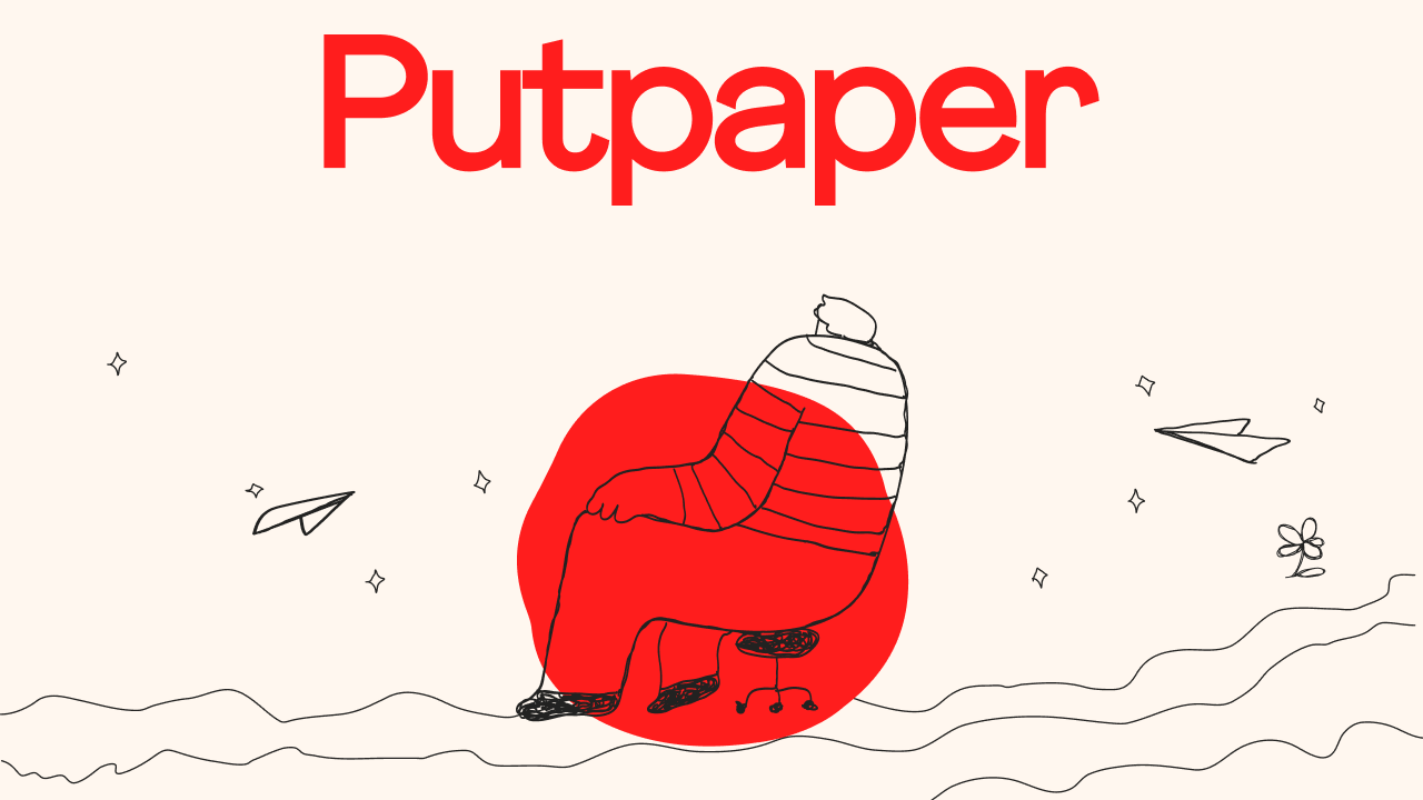
Logotype

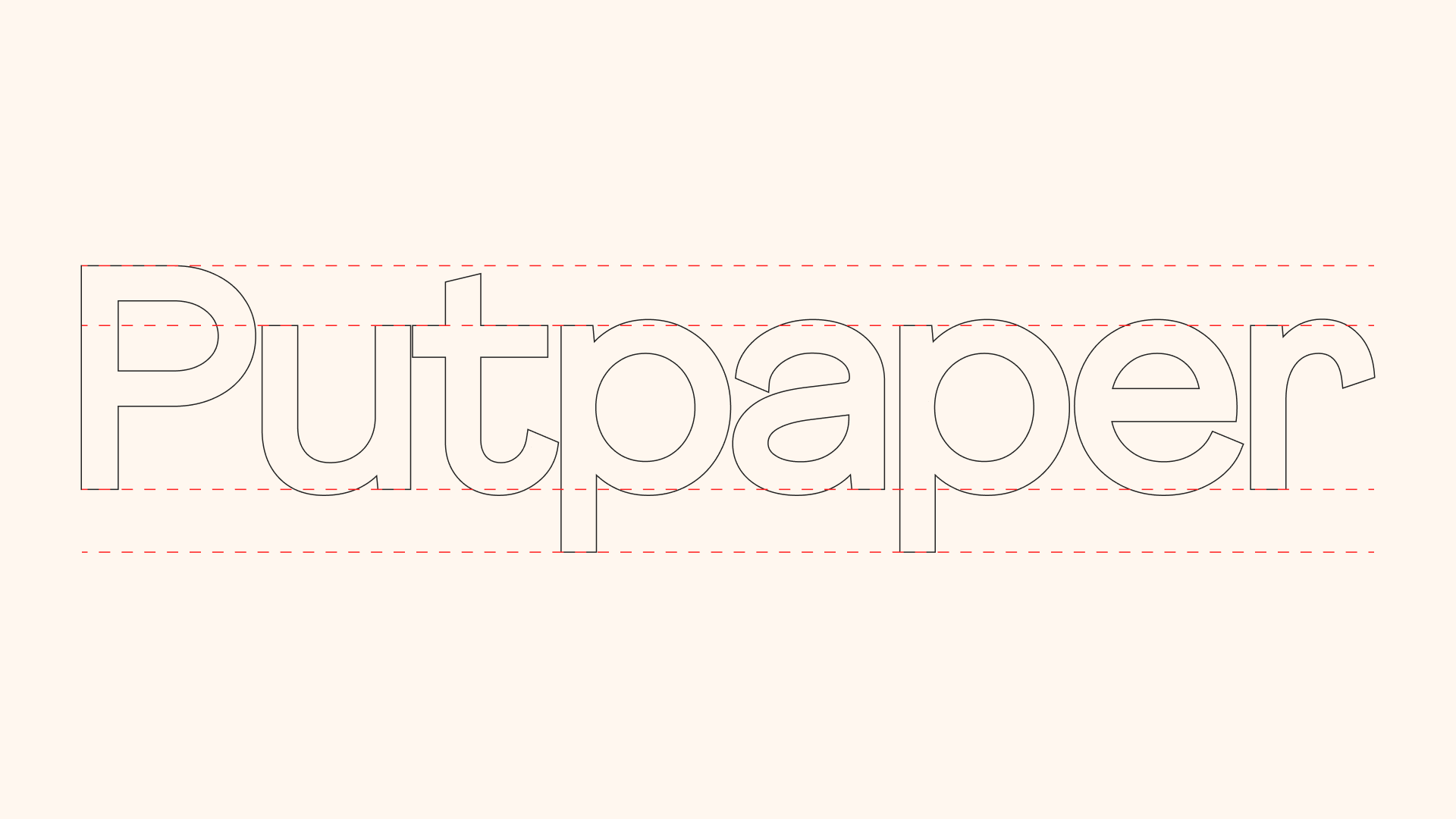
Typeface for Display

Typeface for Text
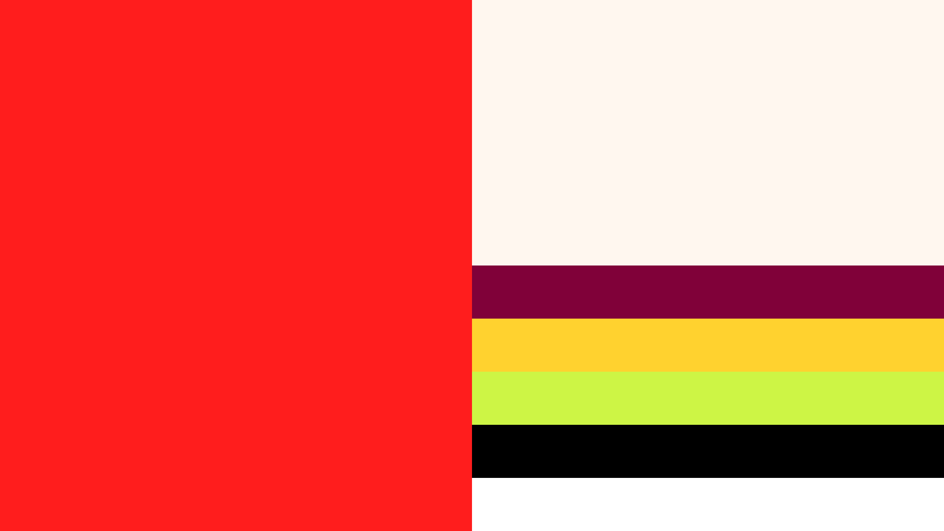
Colour palette for the brand
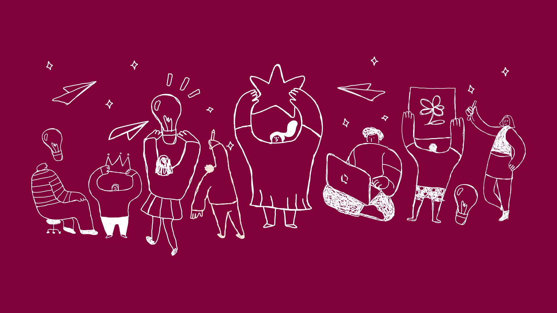
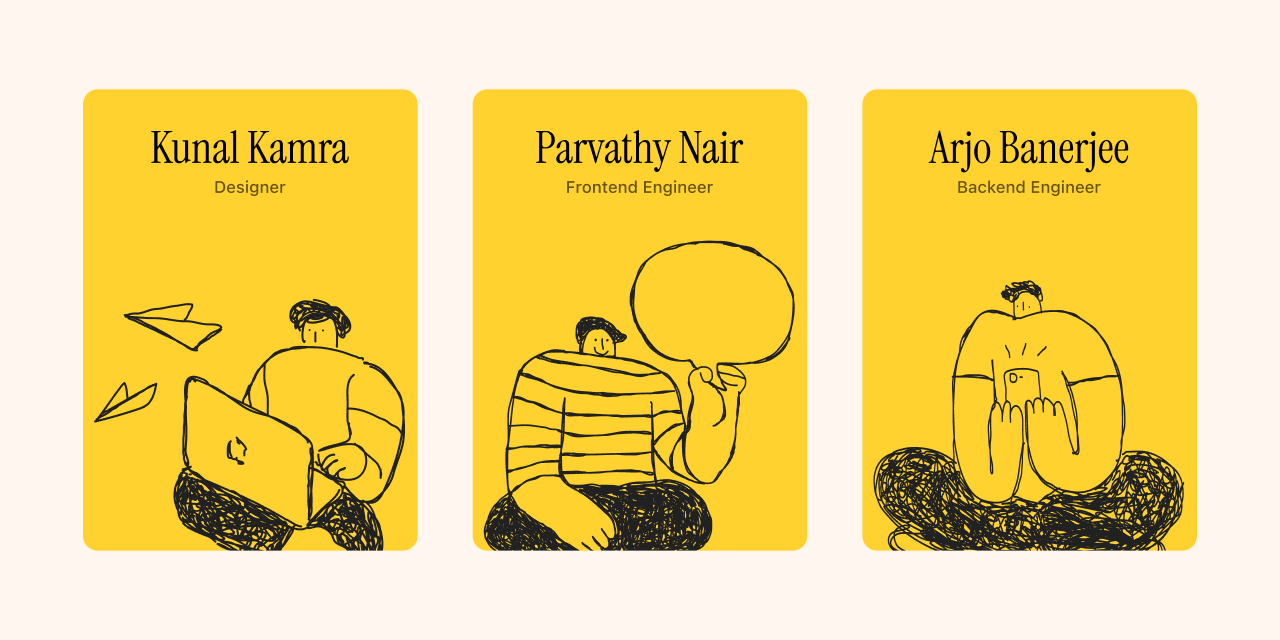
Illustration set
Expert advisors
Suhas is exceptionally good at his craft. On multiple projects, he's taken the absurdly vague notes I have on the brand and design direction and served us outputs that we fell in love with. He often asks simple and yet hard questions about the product, which made us go back to the whiteboard and rethink. I think he's also an excellent copywriter, though he won't agree with me. If you're looking for a sharp finish, he's your man.
Nirmal Raj
The Challenge
Career transitions are intimidating. Whether you're switching jobs, taking a break, or figuring out your next move, the process is filled with uncertainty and anxiety. Putpaper wanted to build a platform that made this journey feel less daunting — more guided, more human, and more community-led.
The design challenge was to create a brand that felt trustworthy and empowering without feeling corporate or clinical.
The Approach
I worked on the brand identity, UI direction, and overall visual language. The identity uses simple typography, warm tones, and sketch-like illustrations to strike a balance between structure and empathy — signalling that Putpaper is both reliable and human.
Every element was designed to make the experience feel like a companion rather than a tool. Something that walks alongside you during an uncertain phase rather than just processing your data.
The Result
A brand identity that turns something as intimidating as a career change into a more hopeful and collaborative journey. The client, Nirmal Raj, described the experience: "He often asks simple and yet hard questions about the product, which made us go back to the whiteboard and rethink."