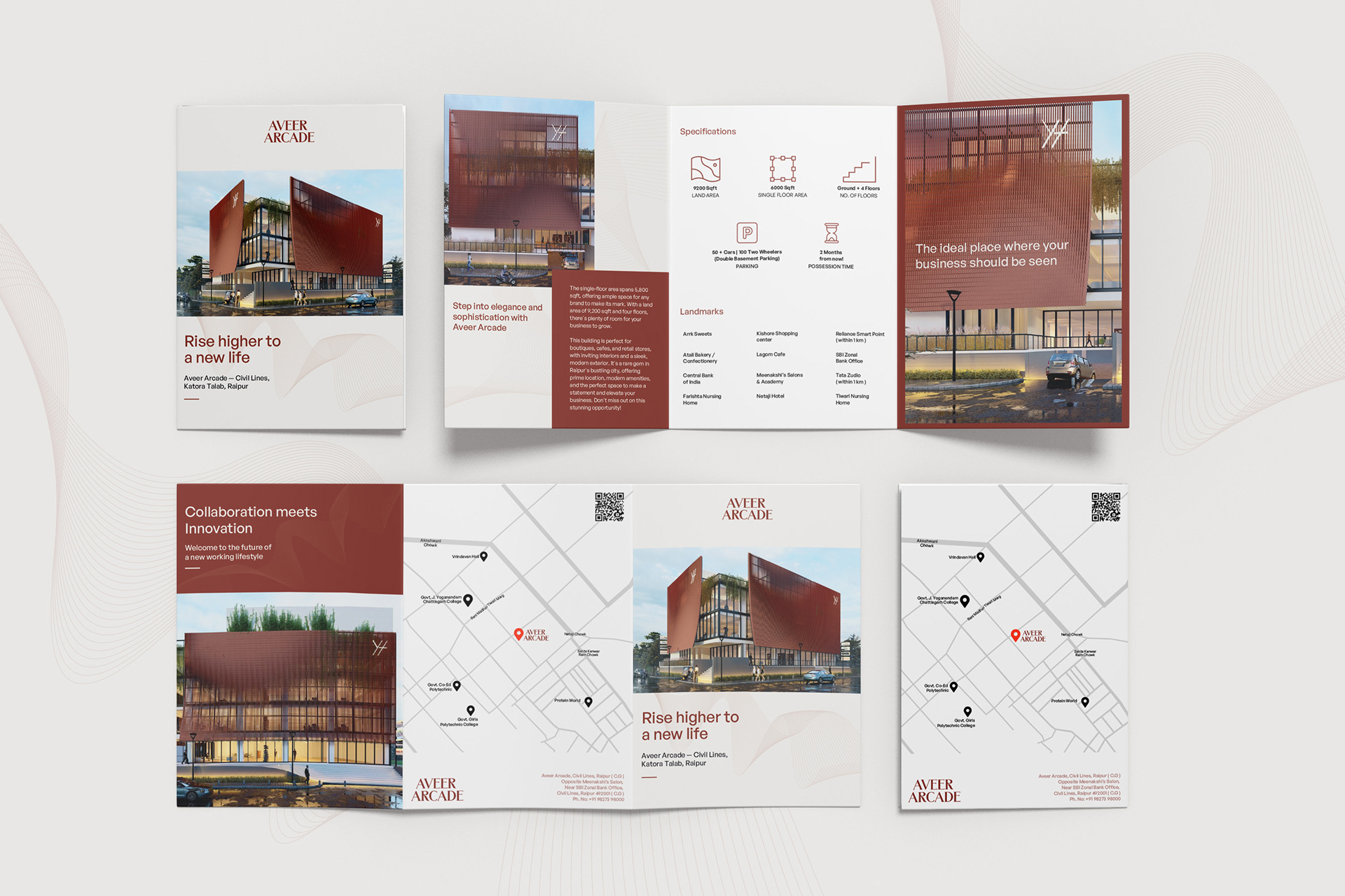
Brochure Design for each project
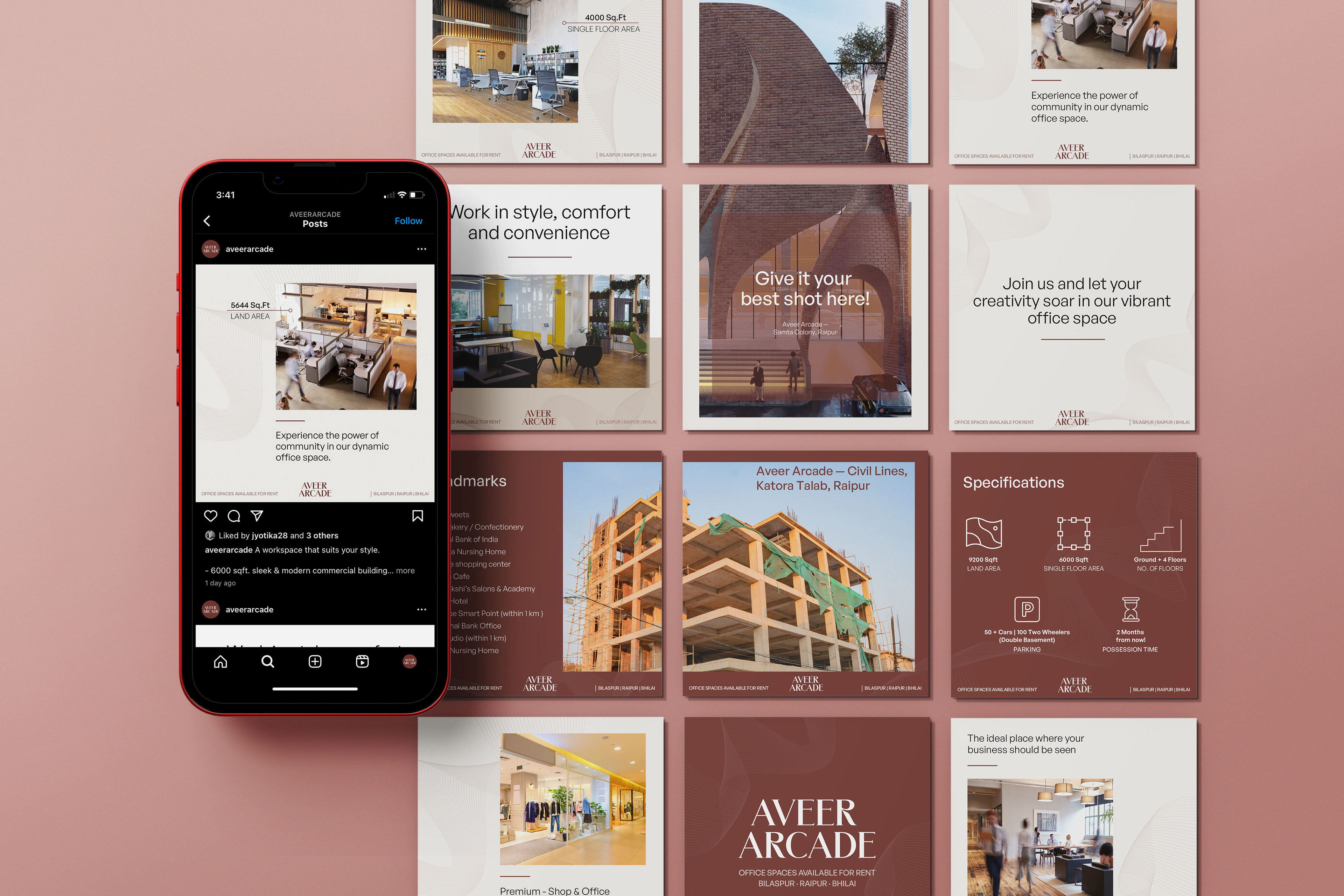
Social Media Creatives
The Challenge
As hybrid work became the norm, Aveer Arcade saw an opportunity to create a premium co-working space in Raipur that merged the comfort of home with the productivity of a professional environment. The challenge was building a brand identity that clearly communicated that premium positioning in a market still getting familiar with the concept.
The Approach
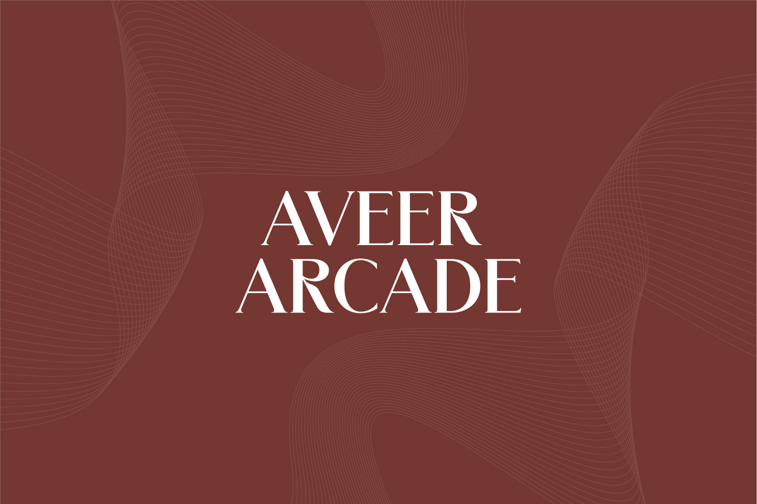
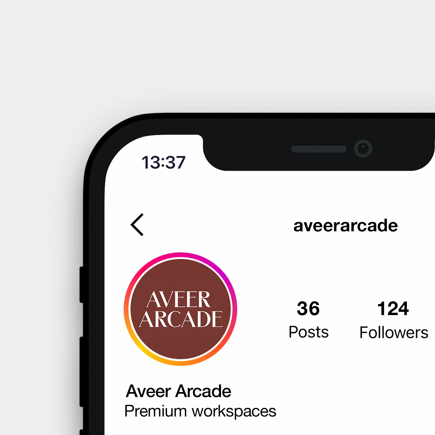
I developed a type-based logo using a serif typeface chosen to reflect the sophistication and professionalism of the brand while also conveying a sense of innovation. The typographic approach gave Aveer Arcade a premium, elegant identity that felt distinguished without being cold or inaccessible.
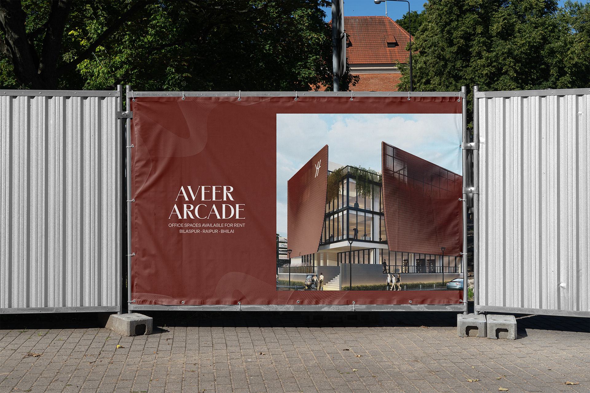
The visual system extended across brochure design and social media creatives, ensuring the brand felt consistent and intentional across every touchpoint a potential member might encounter.
The Result
A refined brand identity that positioned Aveer Arcade as a distinguished workspace provider — premium enough to attract professionals, warm enough to feel welcoming.
Creative Direction: Khushbu Sanghi @ Wishbox India
What I Learned
Type-led identities demand precision. When the logo is purely typographic, every curve, spacing decision, and weight choice carries the full weight of the brand. There is nowhere to hide — and that's exactly what makes it interesting.