The Challenge
Prinova offers flexible ink solutions using advanced print technology for businesses of all sizes. Emerging in a competitive startup landscape, they needed an identity that felt modern, bold, and trustworthy — international in feel, premium in execution, but still approachable and grounded for their audience.
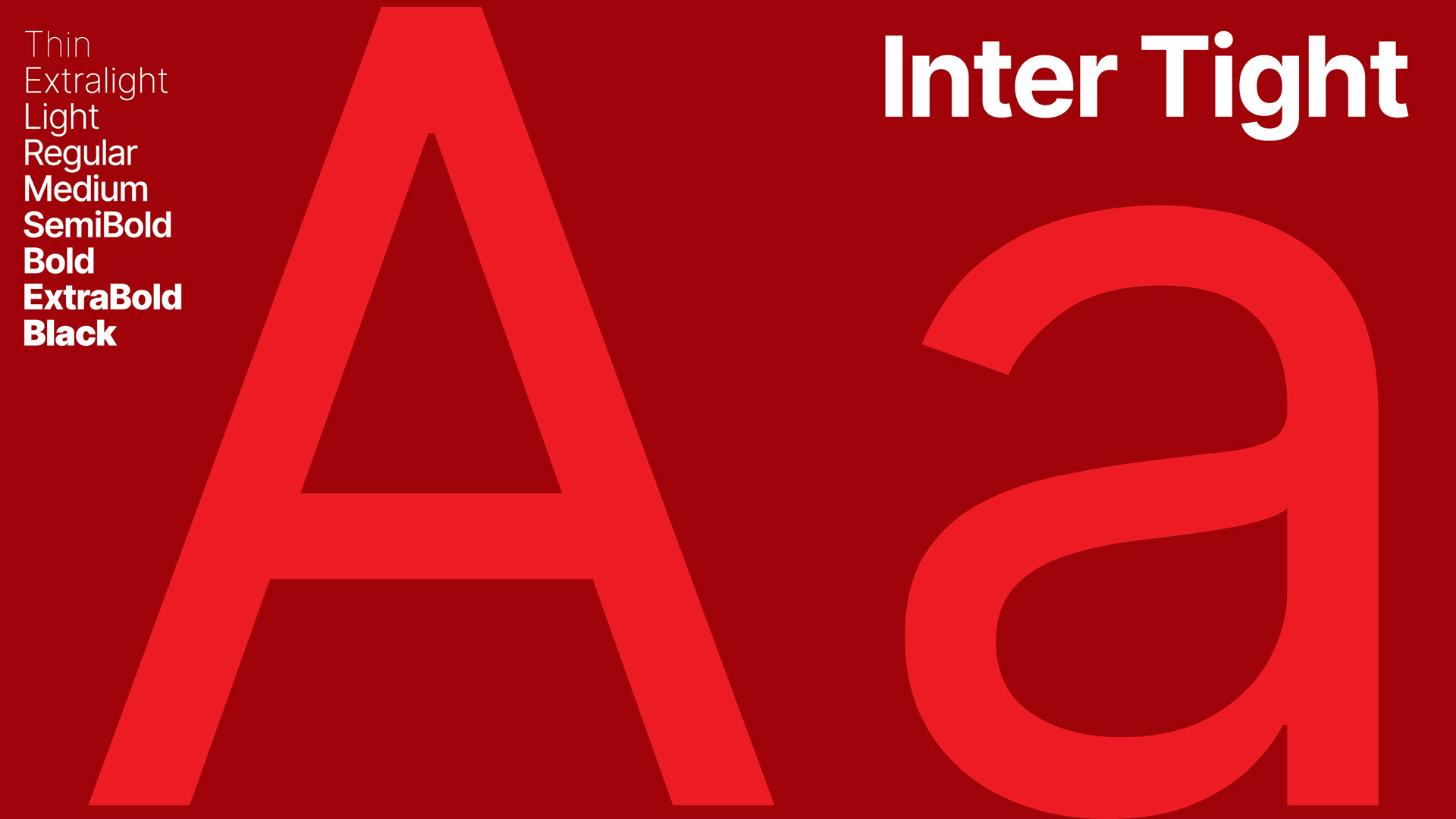
The Approach
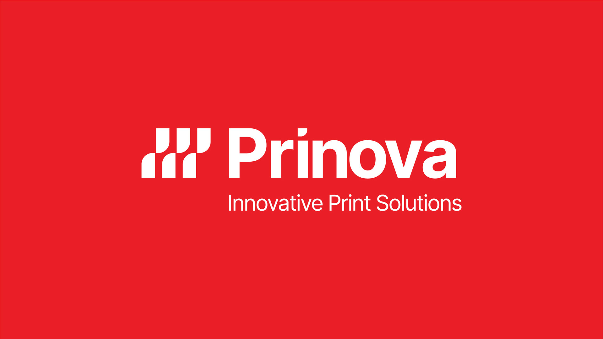
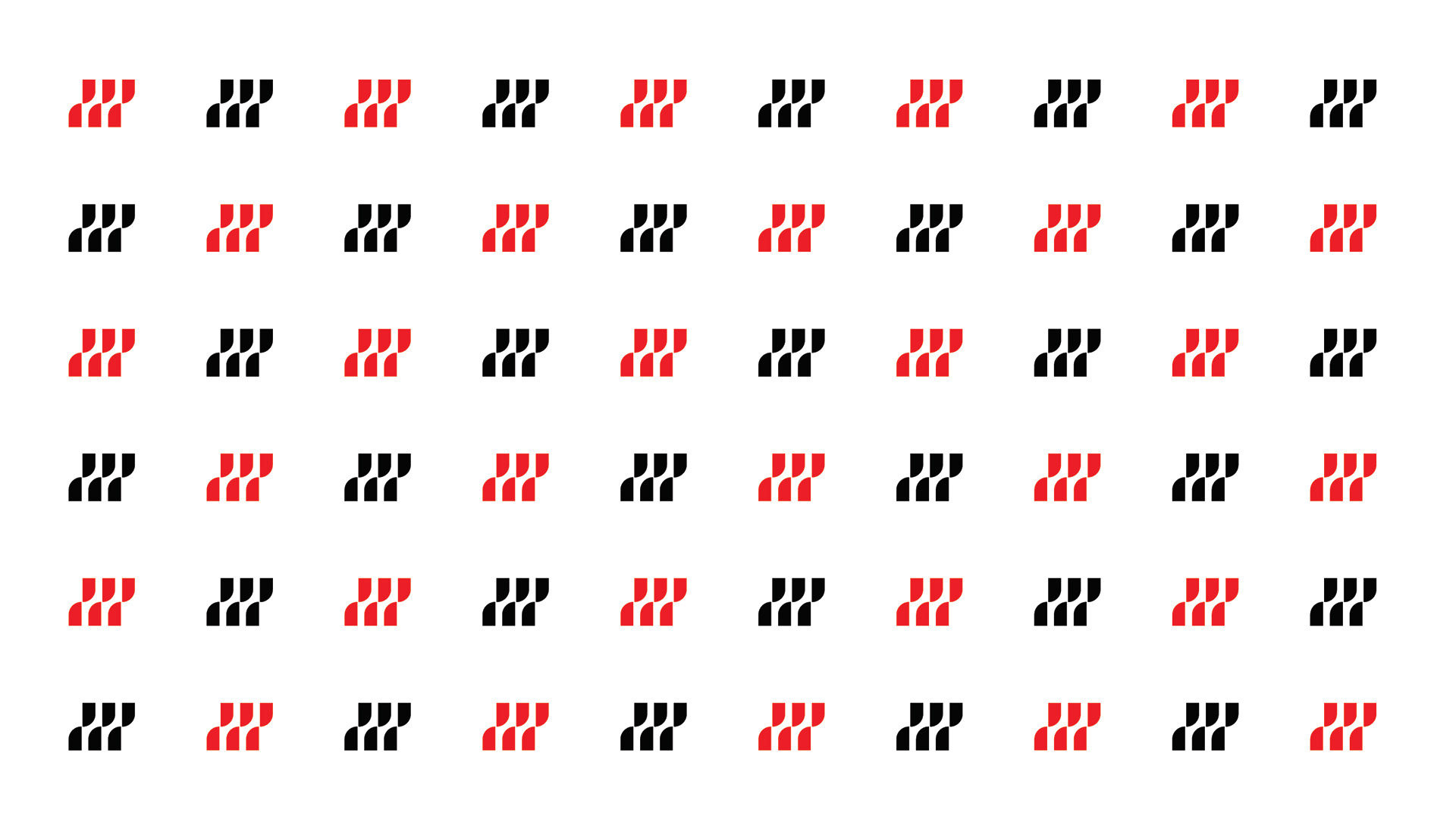
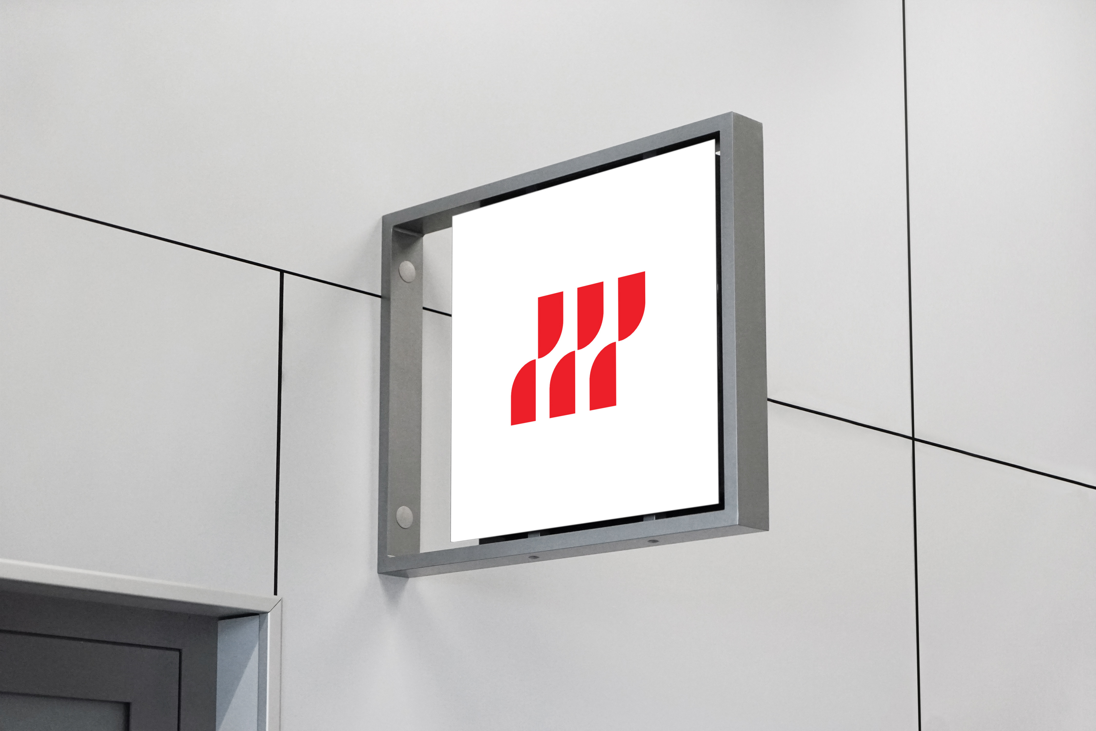
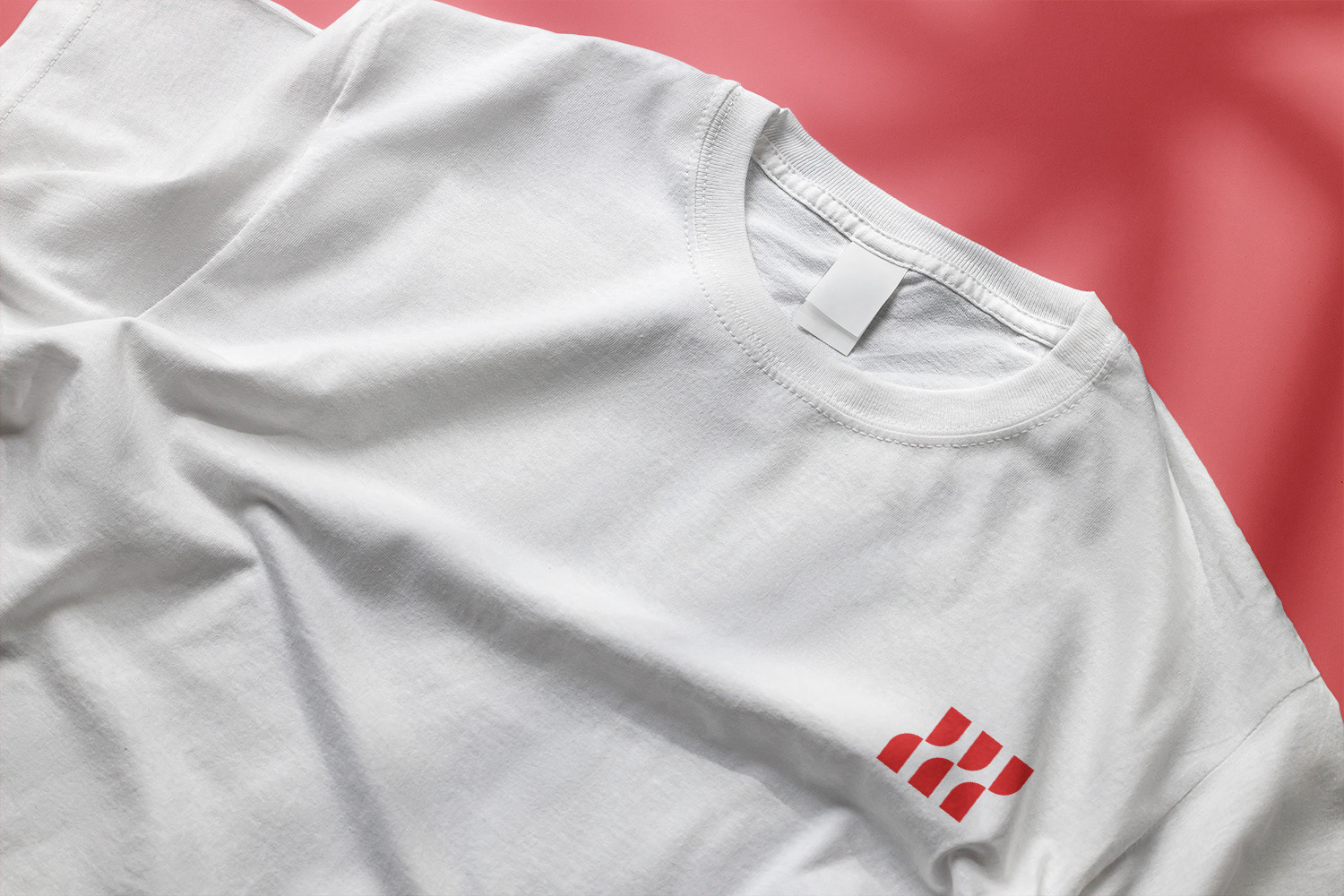
I developed an abstract logo built around the idea of continuous yet synchronised movement, representing Prinova's core proposition of flexible, scalable solutions. The symbol incorporates the letter P, reinforcing brand recognition while adding a layer of visual sophistication.
The overall identity was designed to feel like it could compete on an international stage — clean, confident, and distinctive — while remaining accessible to the wide range of businesses Prinova serves.
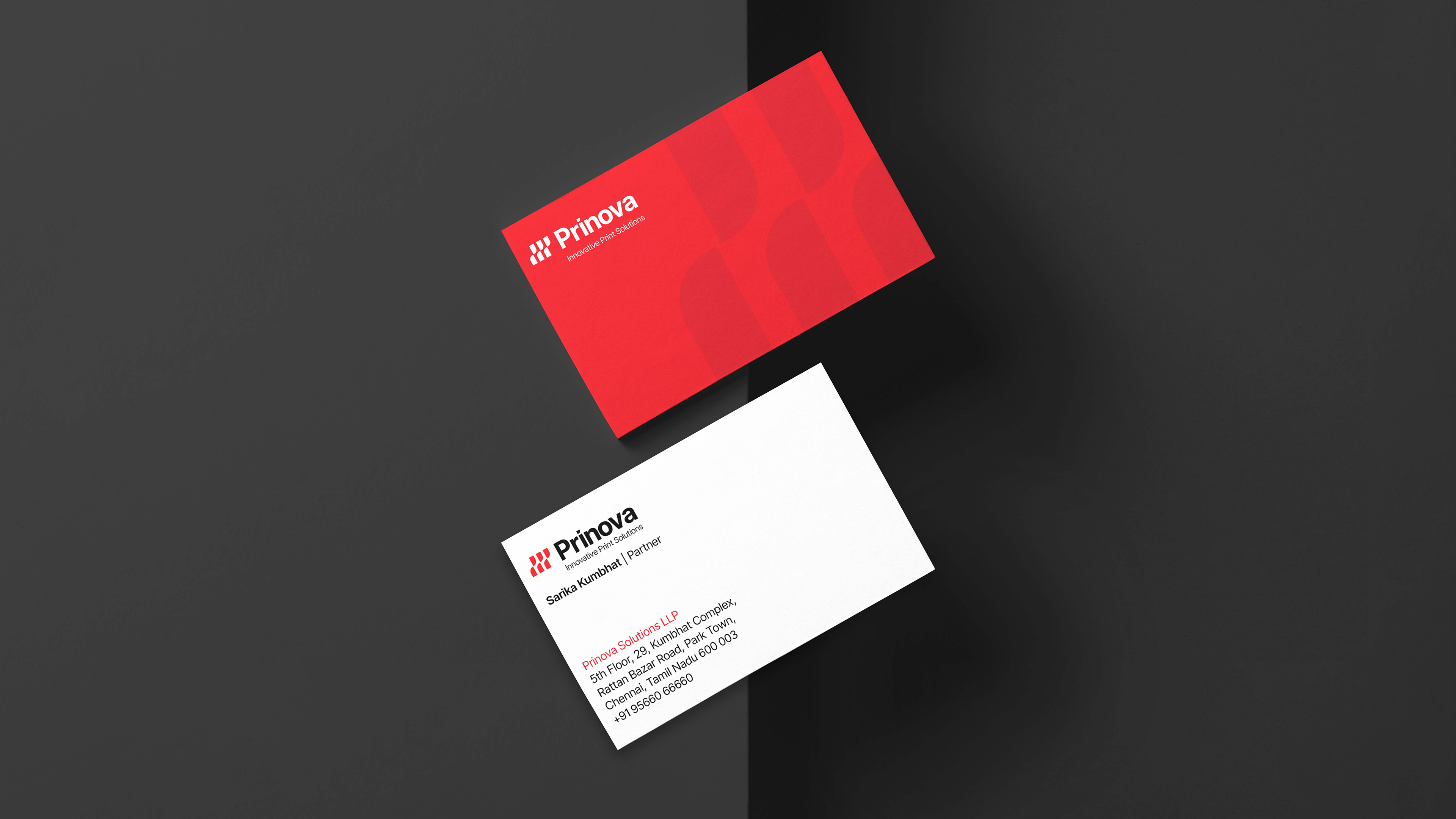
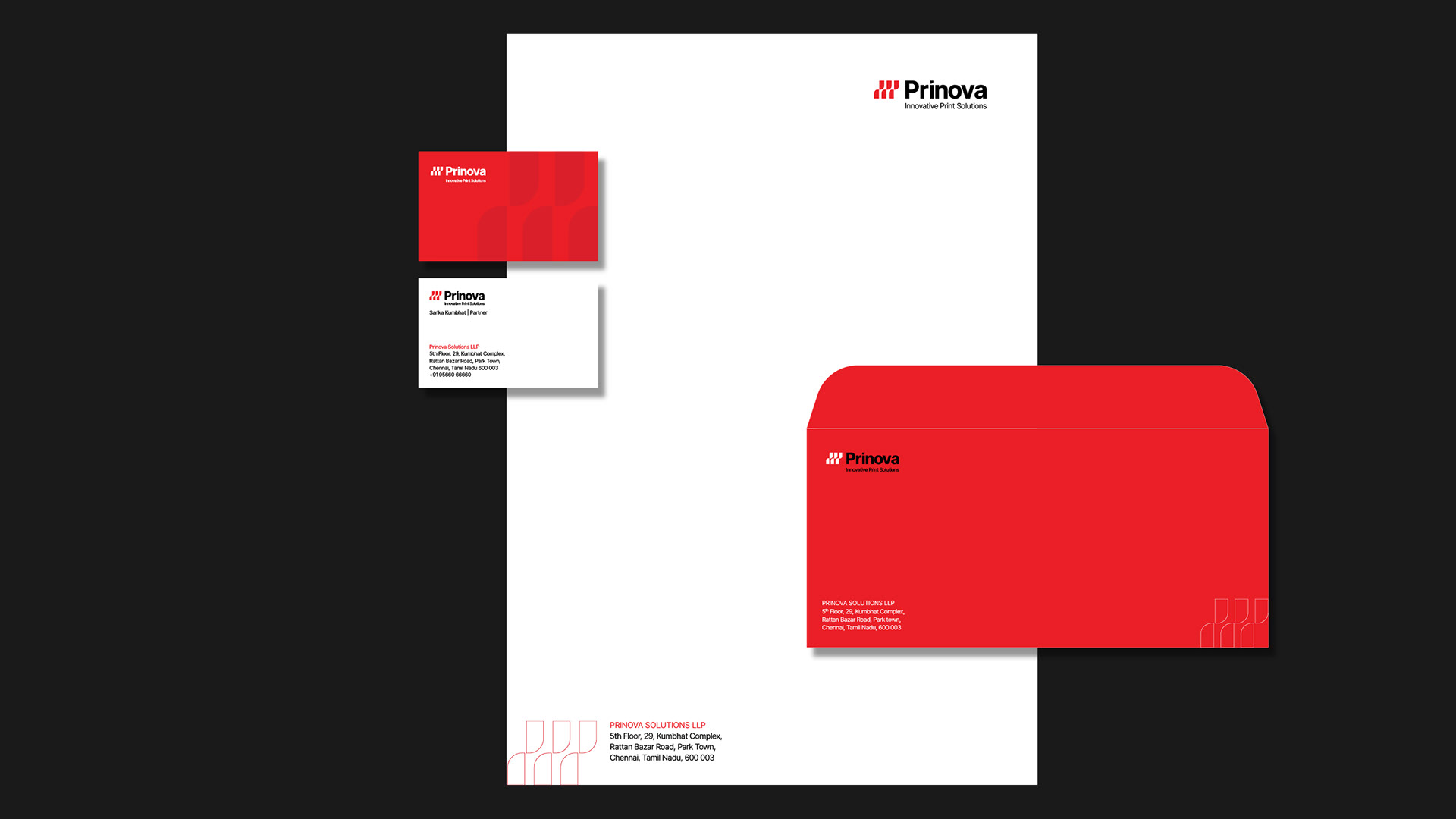
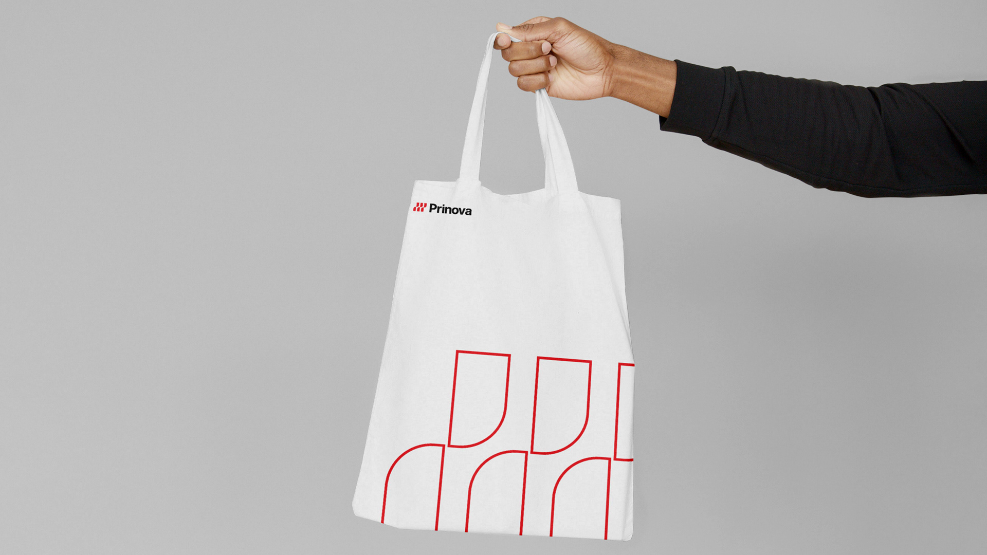
The Result
A bold, modern brand identity that gave Prinova a visual presence strong enough to stand out in a crowded market and instil trust from the very first impression.
Creative Direction: Khushbu Sanghi @ Wishbox India