The Challenge
The Indian beer market is crowded and increasingly competitive. Brands like Bira 91 and Simba have shaped the visual landscape through mascots, illustrations, and character-driven storytelling. The question this project set out to answer: could a beer brand stand out by doing the opposite — through clarity, boldness, and a more minimal visual language?
Beer Republic was conceived as a conceptual brand built for today's Indian market, targeting beer lovers, Gen Z and millennials, and anyone curious to explore the category.
The Idea
The name says everything. A republic is people coming together under a shared identity — and that's exactly what beer does. It's communal, social, and human.
The challenge was translating that idea into a visual system that felt both premium and approachable, without relying on the mascot-heavy conventions the category leans on.
The Approach
Three elements form the foundation of the identity:
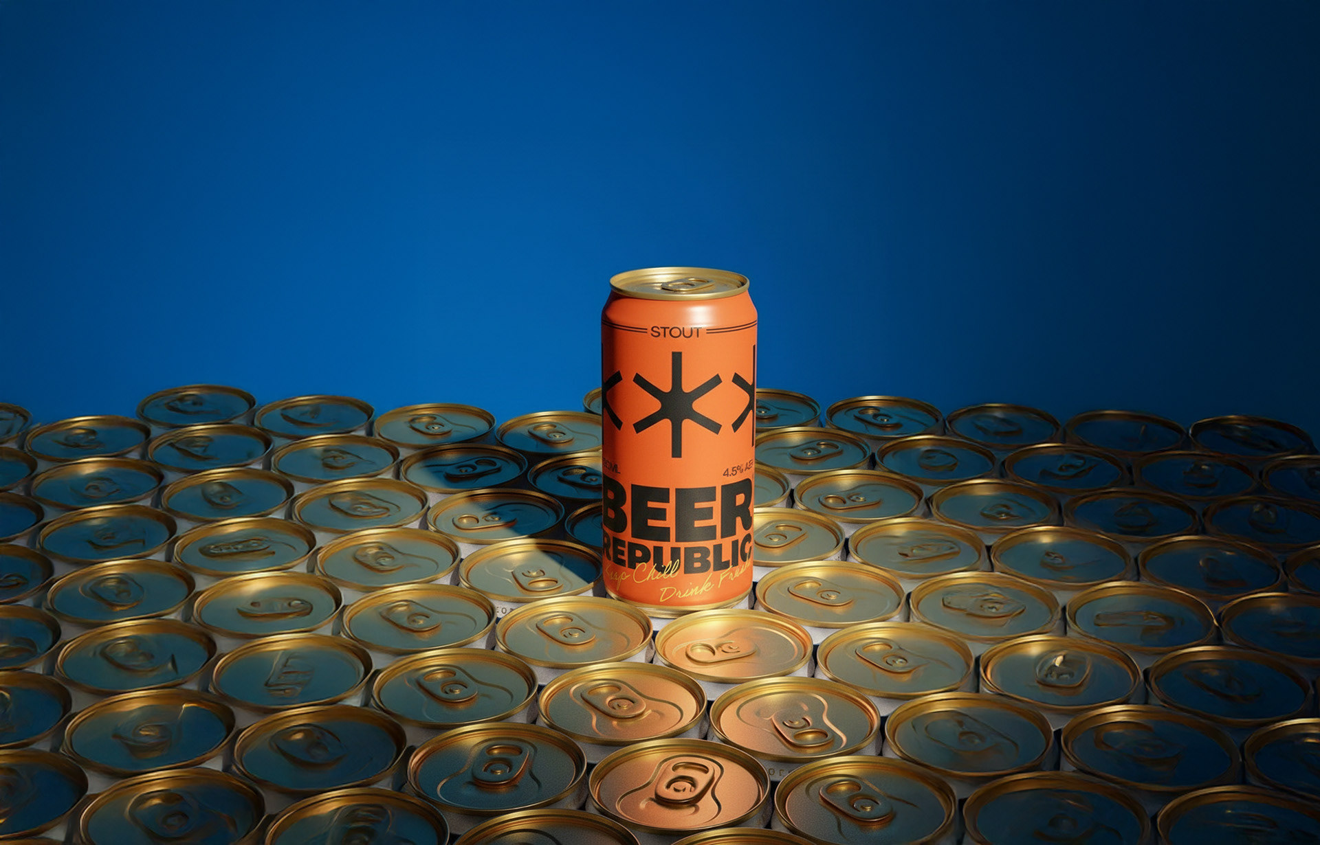
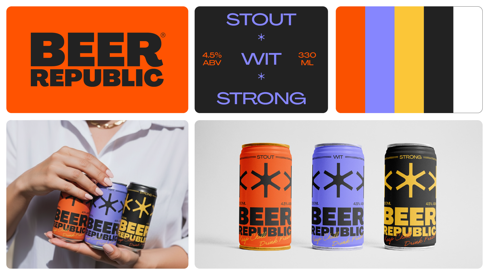
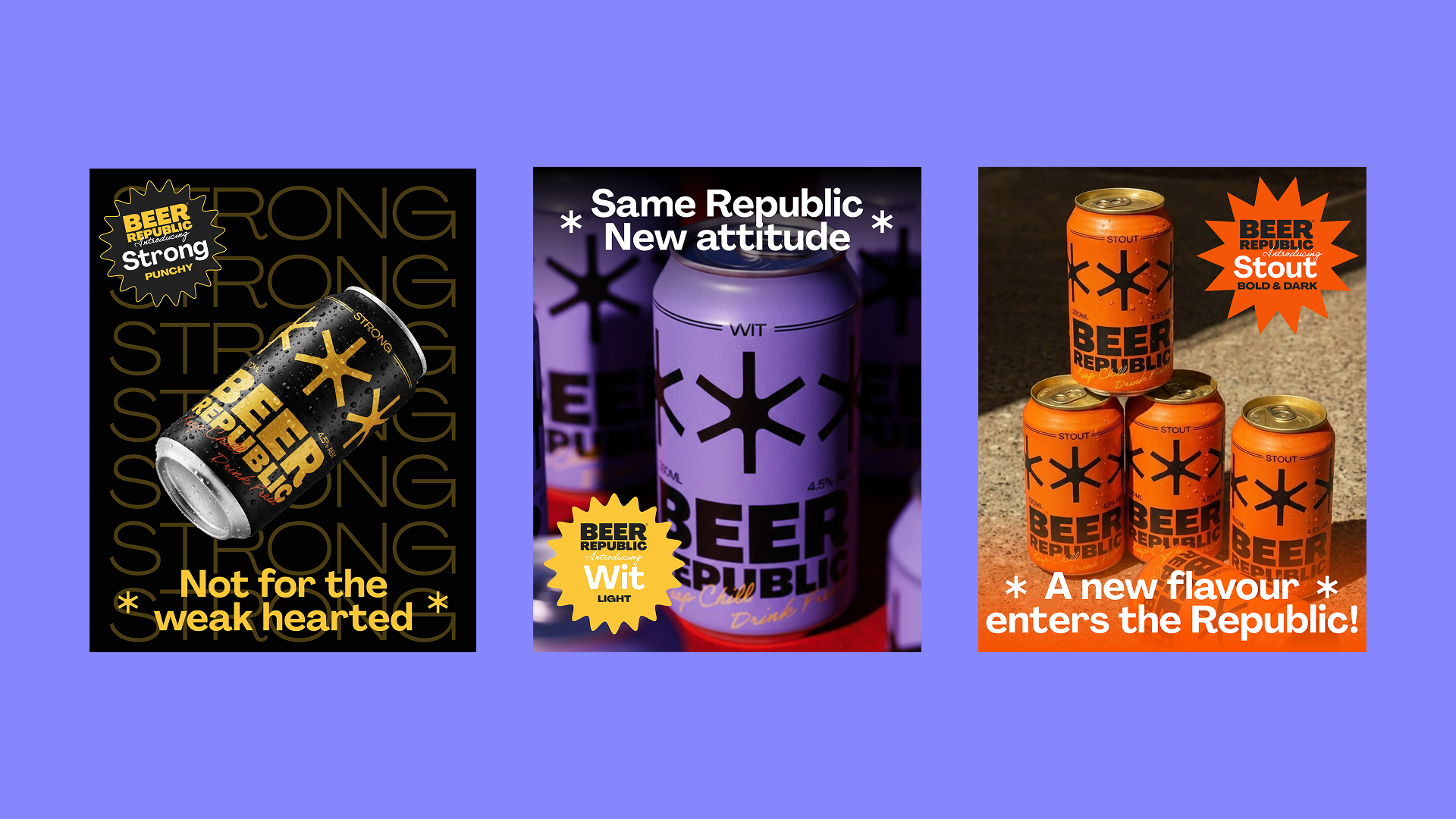
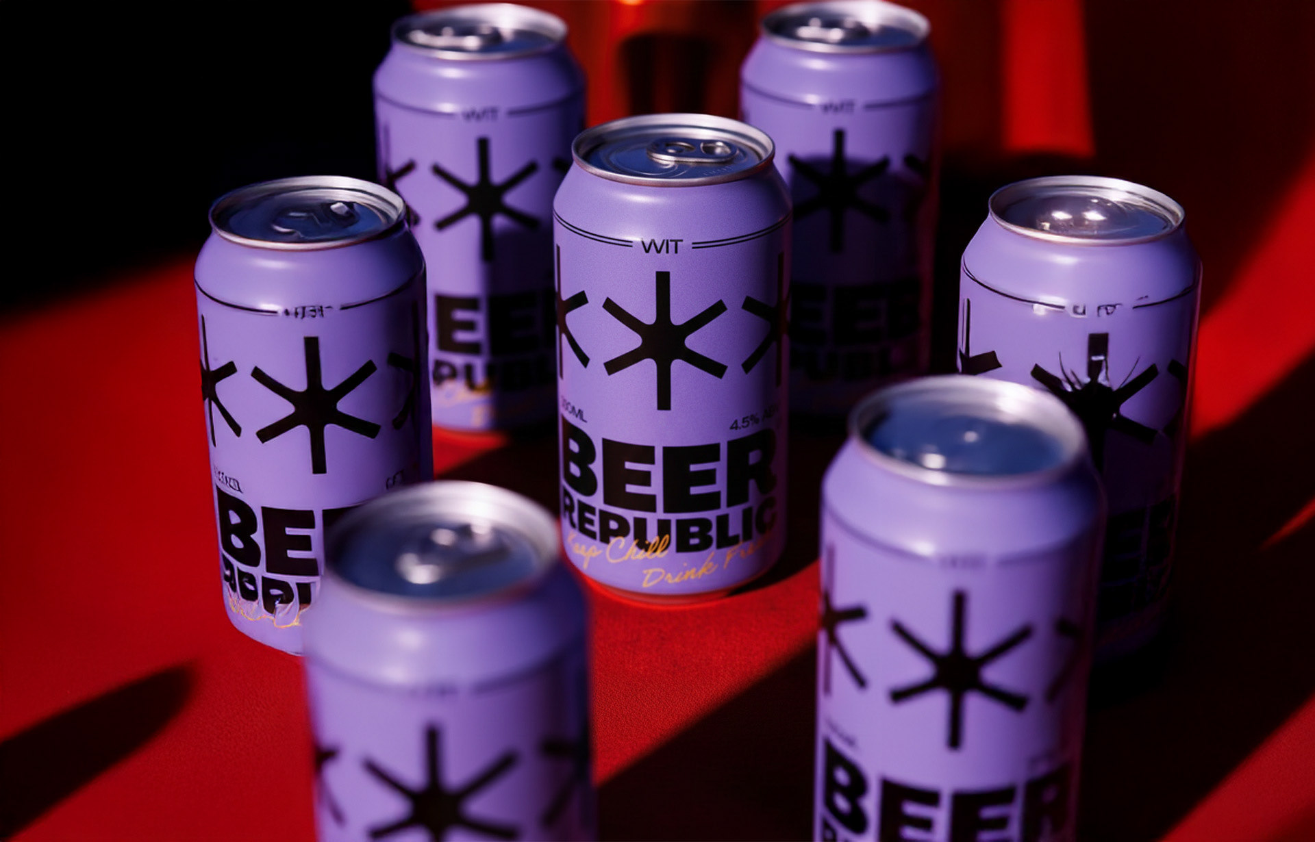
The symbol — A star-like mark constructed from multiple lines converging into a single shape, representing people coming together. It works as a standalone brand mark and as a repeating graphic element across packaging, giving the identity rhythm and structure.
Typography — Large, heavy type replaces illustration as the primary storytelling tool. Oversized letterforms create shelf presence and reinforce the brand's confident personality. The product name and style remain immediately legible at any size.
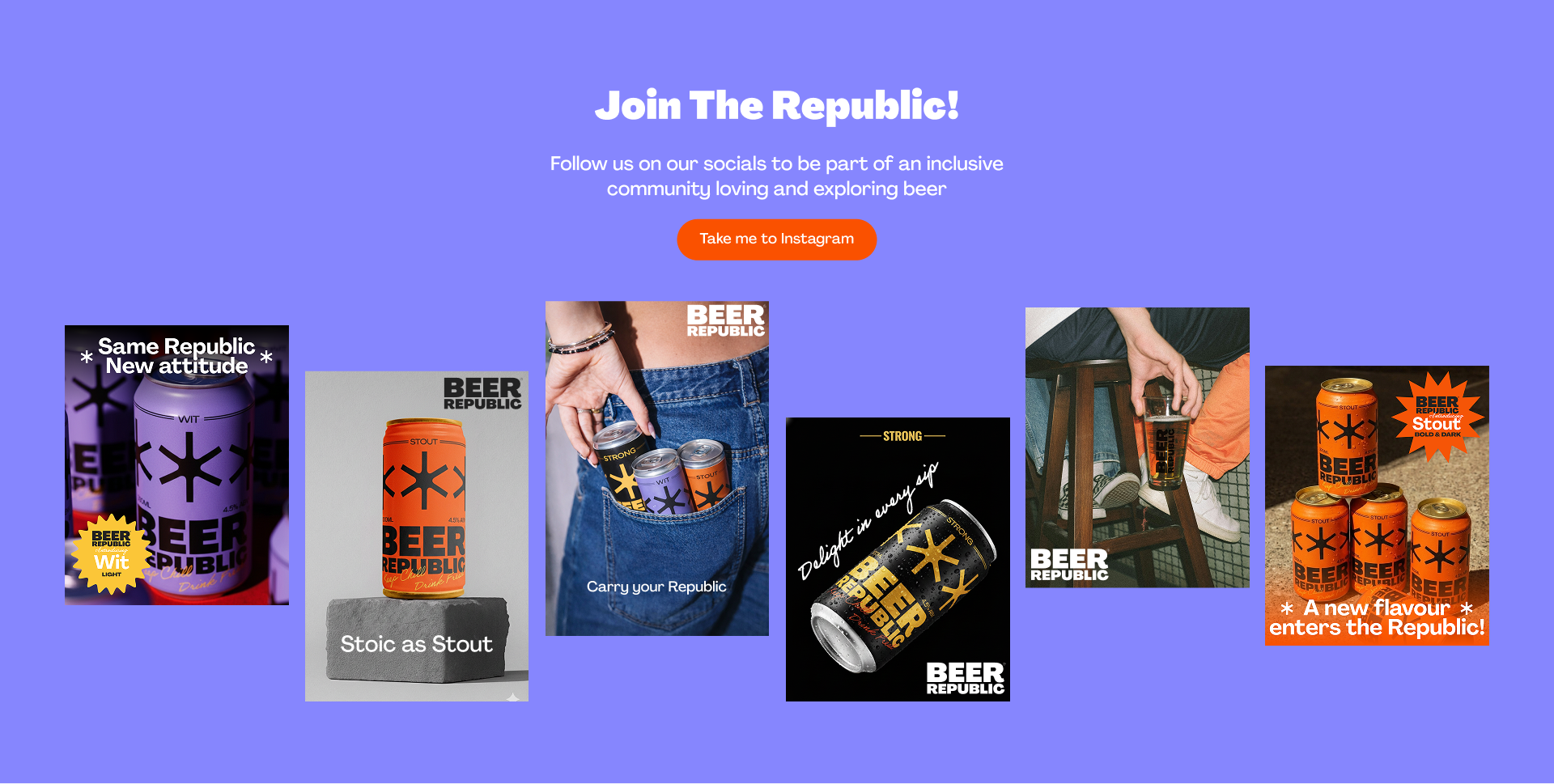
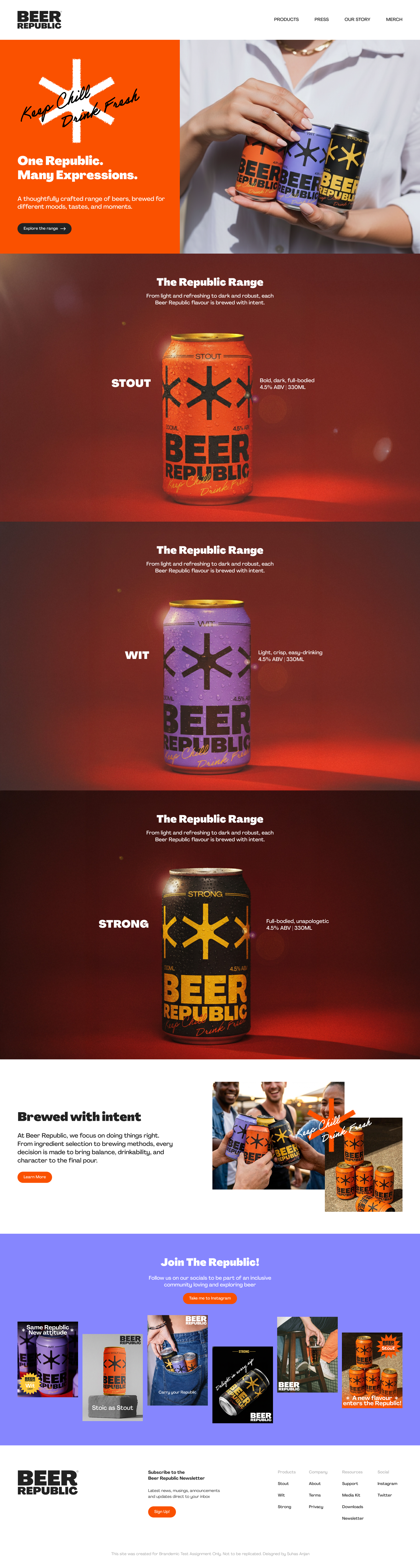
Colour — Bright, saturated tones contrast with bold black typography, creating packaging that feels contemporary and expressive. Colours shift across variants while the core identity stays consistent — allowing the brand to scale across multiple beer styles without losing recognition.
The Result
A visual identity that moves away from the conventions of the category and stands confidently on its own terms. Bold, contemporary, and built for a new generation of drinkers.
What I Learned
Graphic simplicity is not a limitation — it's a strategy. Beer Republic showed me that the most distinctive brands often do less, but do it with total conviction.