The Challenge
Kwarter Club is a bar and kitchen in Bangalore with a dated identity that no longer reflected the energy of the space or the crowd it wanted to attract. In a city with a thriving bar culture and no shortage of options, blending in wasn't an option. The brand needed a refresh that felt bold, social, and instantly recognisable.
The Approach
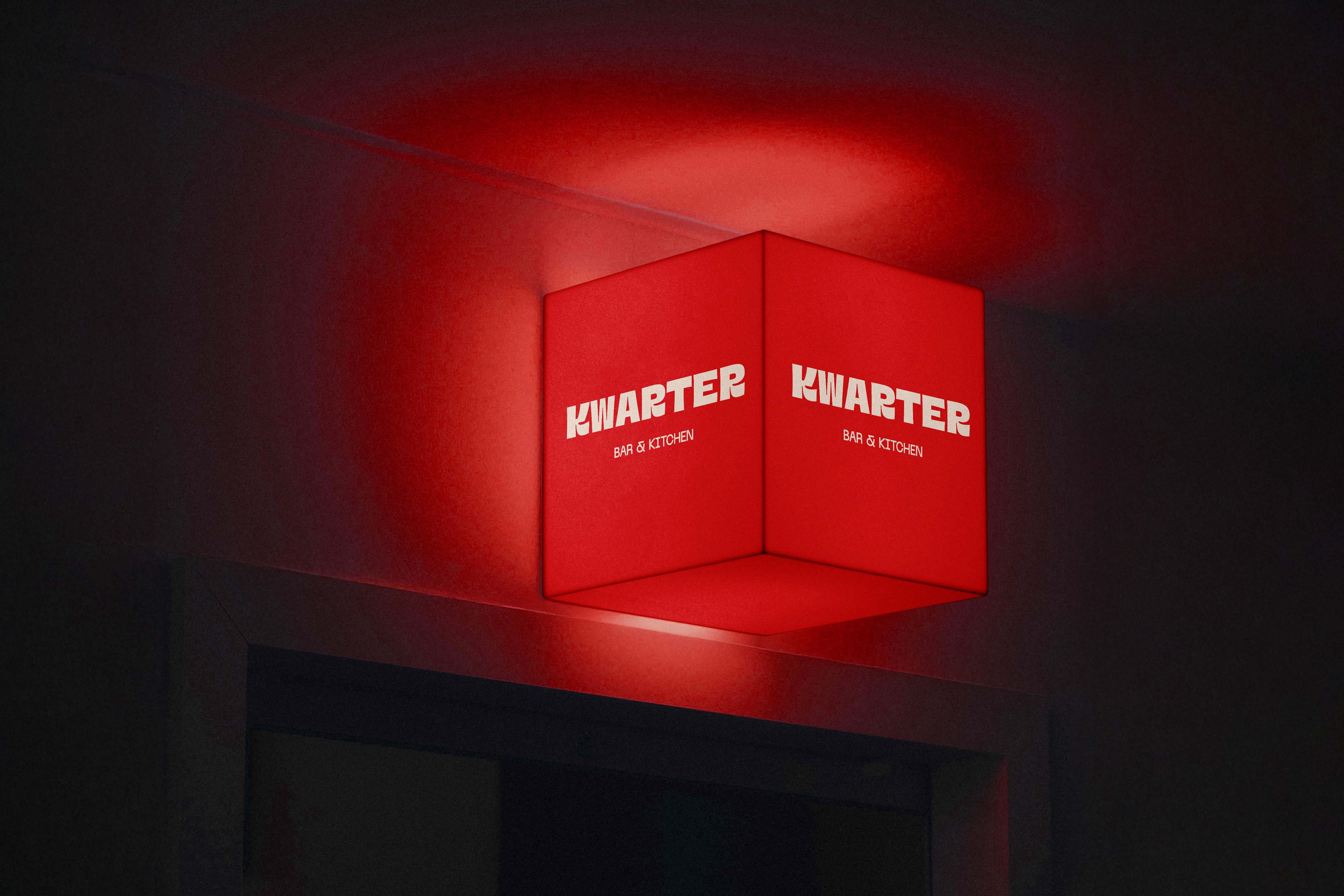
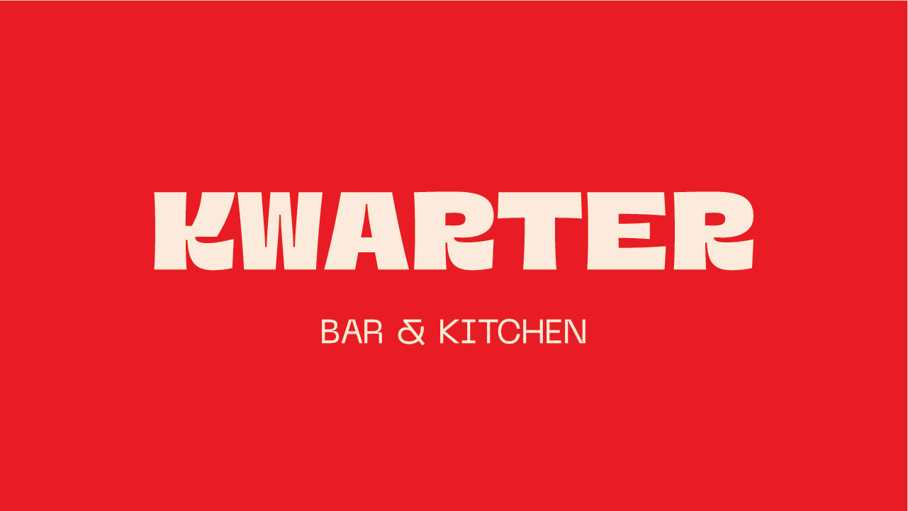
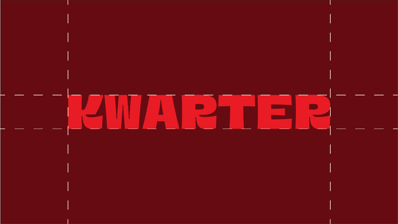
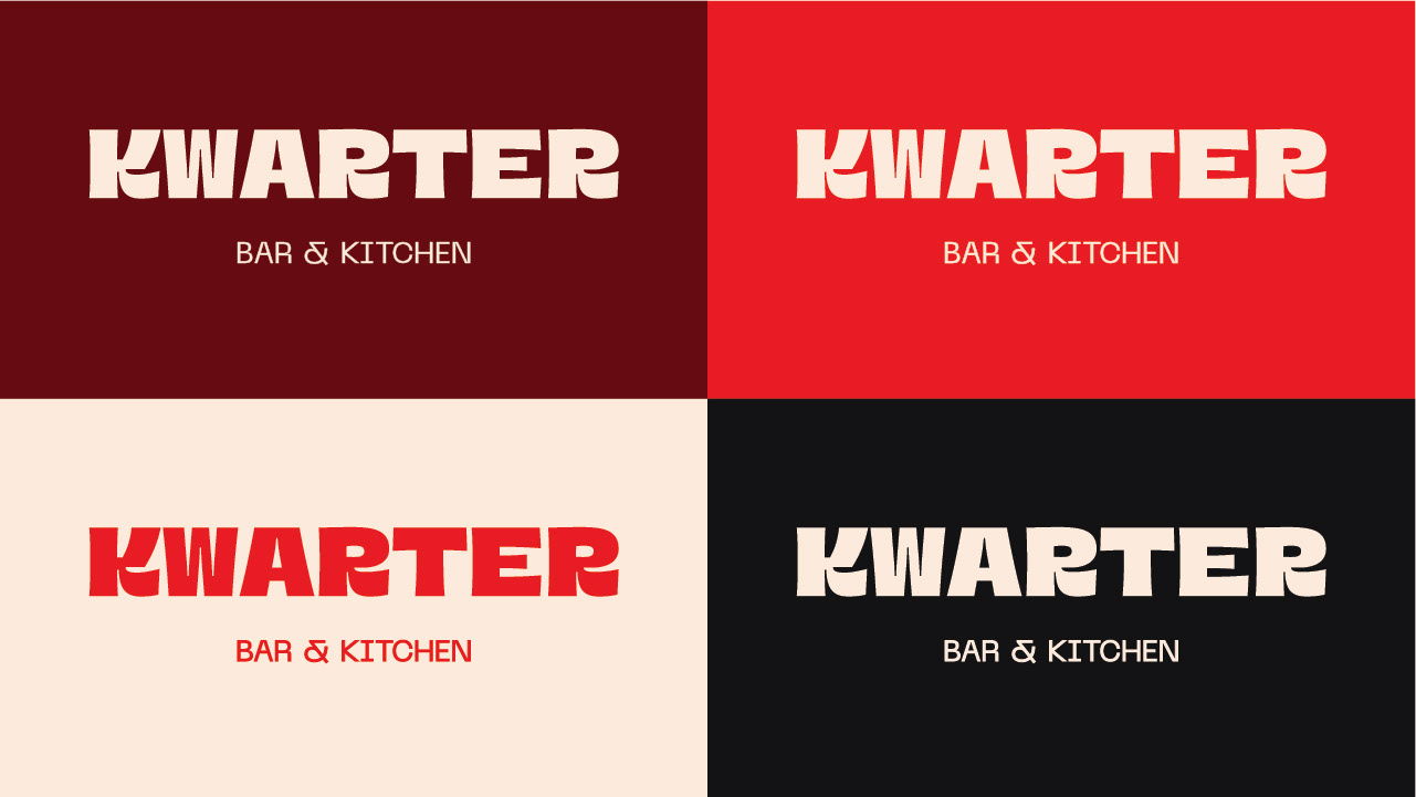
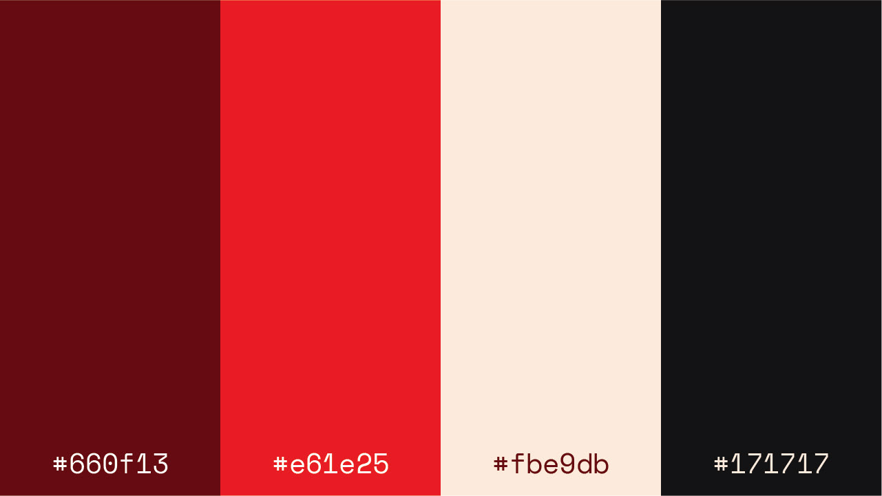
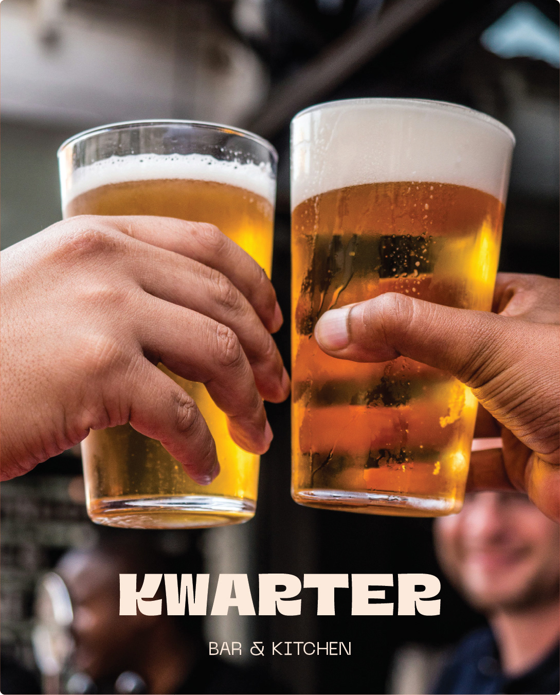
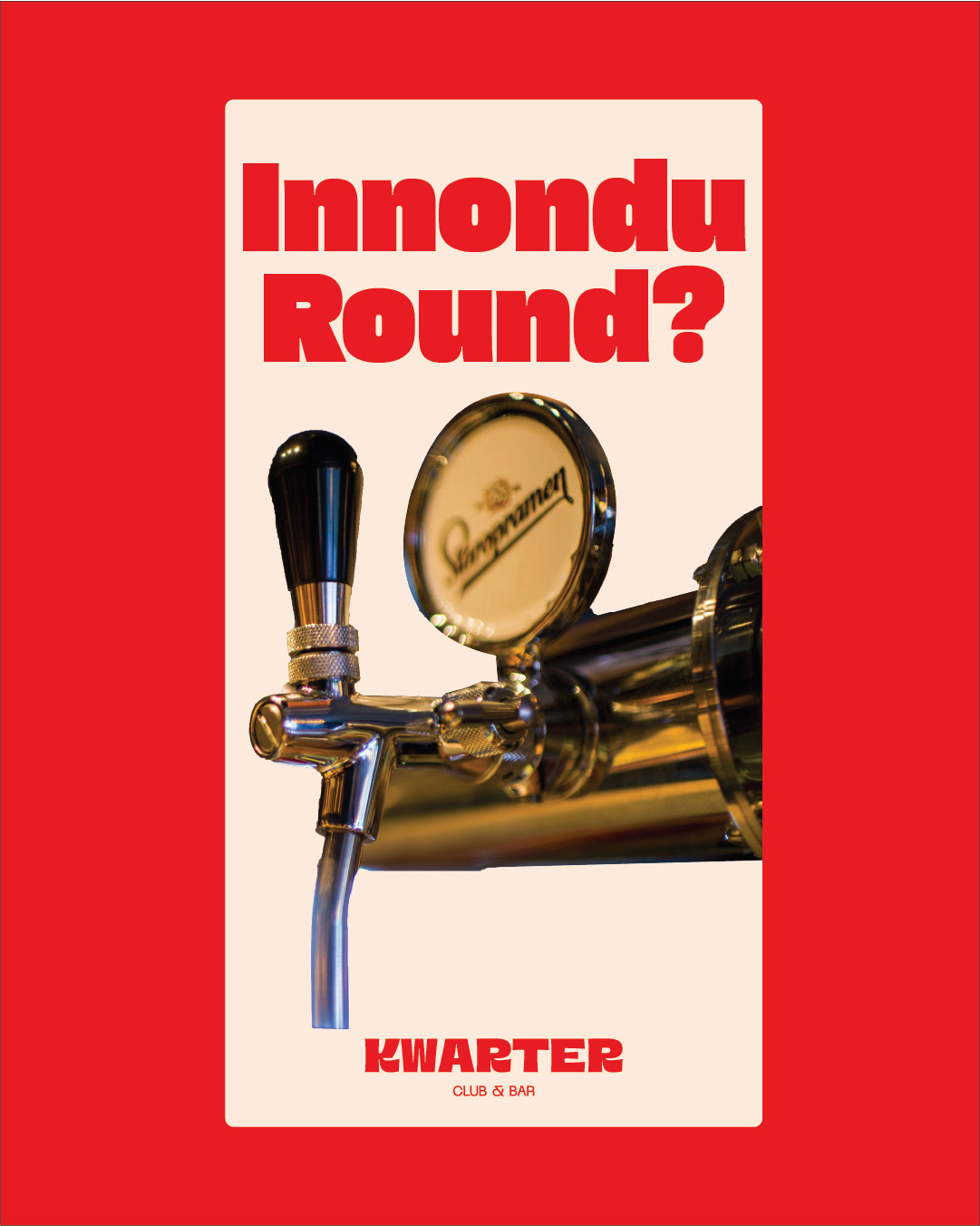
The new identity was built around one central idea: community and good times. Every element was designed to make Kwarter feel like the kind of place where people come together, share rounds, and create stories worth retelling.
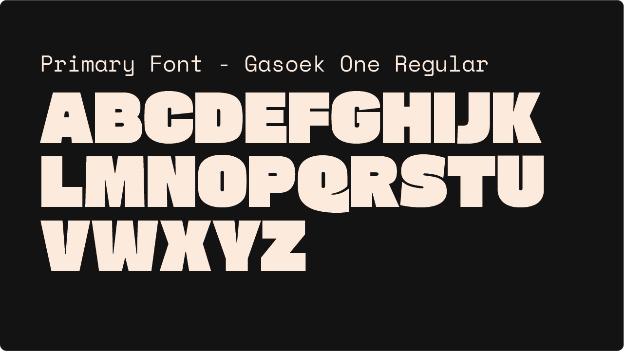
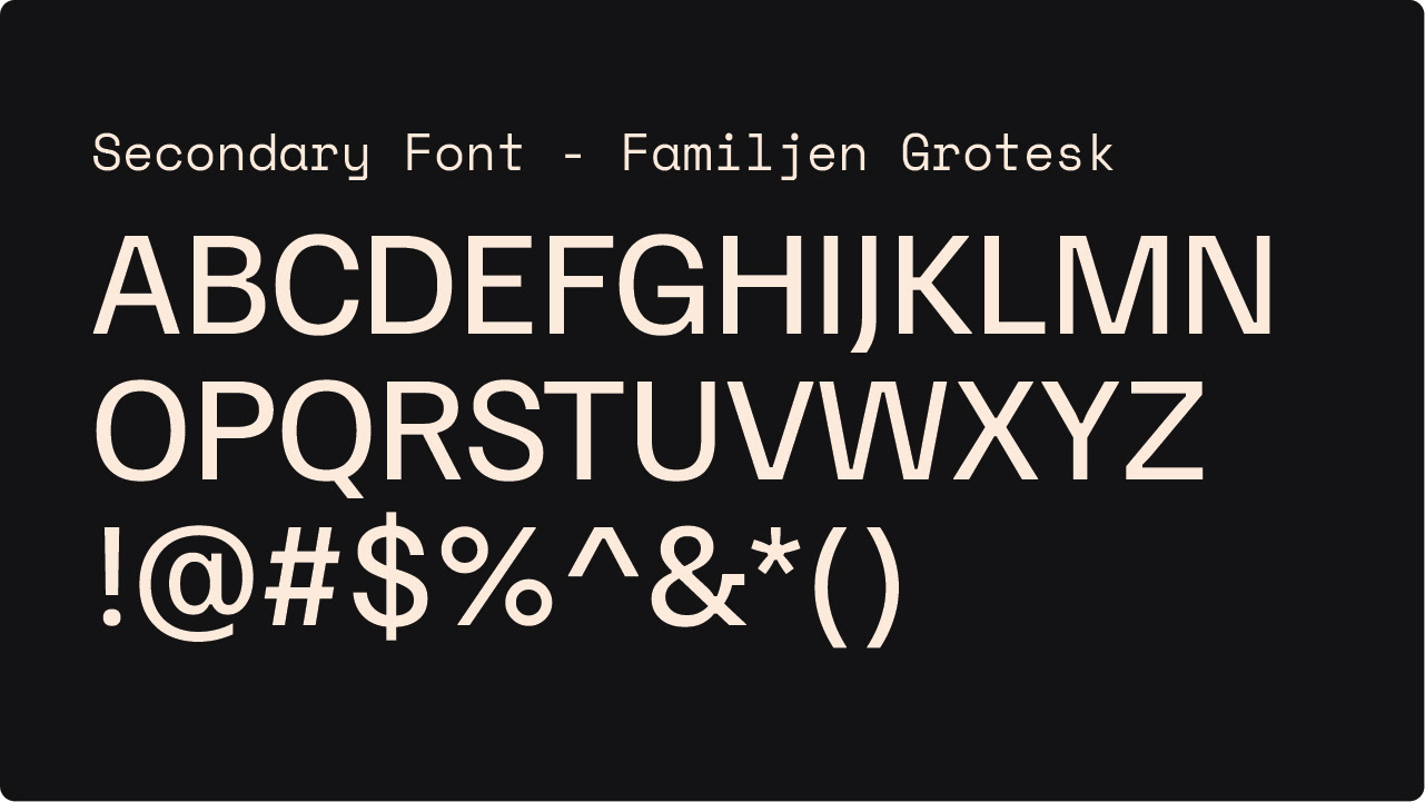
A strong, confident wordmark anchored the identity, paired with a warm red palette chosen for its energy and sense of connection. The typography combined GasoeK One and Familjen Grotesk — a pairing that balances character with clarity, giving the brand a personality that feels approachable yet distinct.
The Result
A refreshed visual identity that positions Kwarter Club as a bold, contemporary bar brand — confident enough to stand out in Bangalore's crowded hospitality scene while remaining warm and inviting to its audience.
What I Learned
Hospitality branding lives or dies on feeling. The best bar brands don't just look good — they make you want to walk in. Every decision here was made with that in mind.