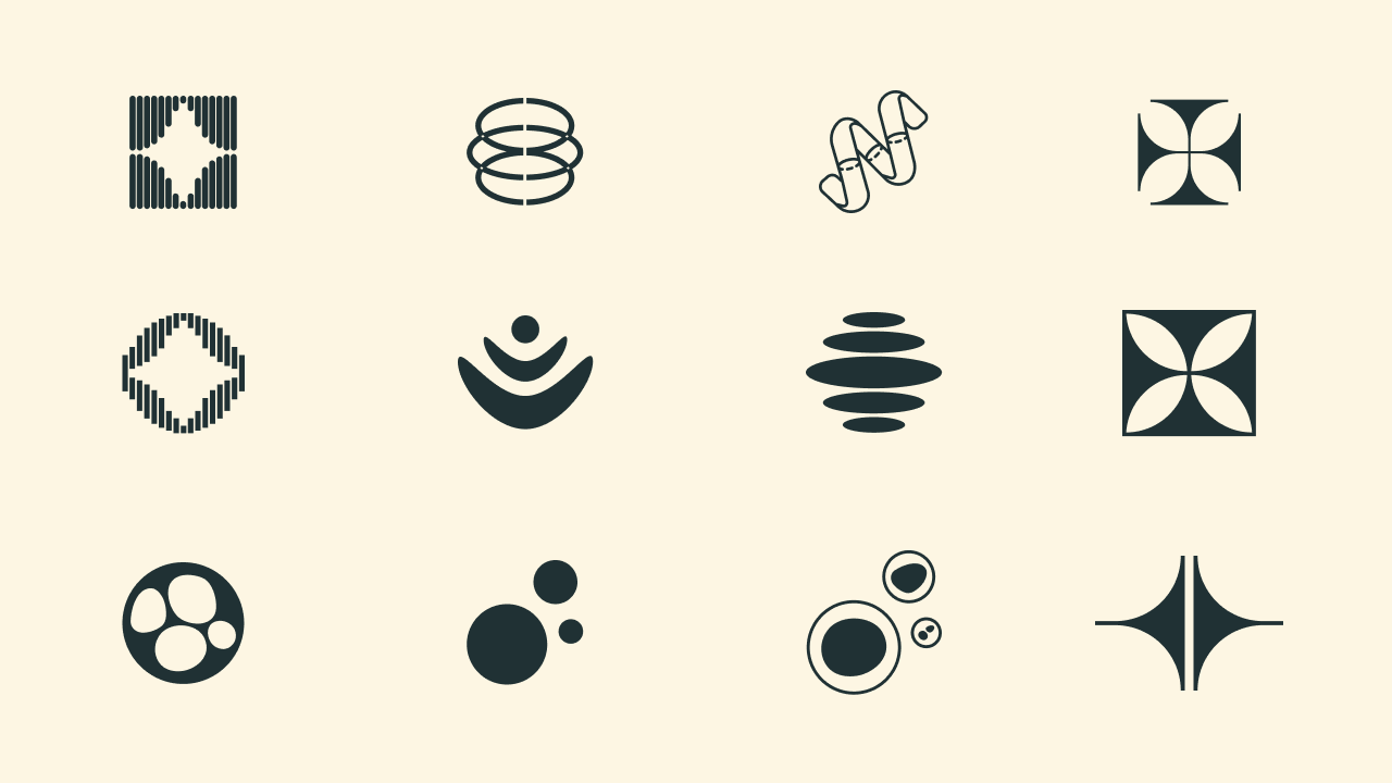
Logo variations
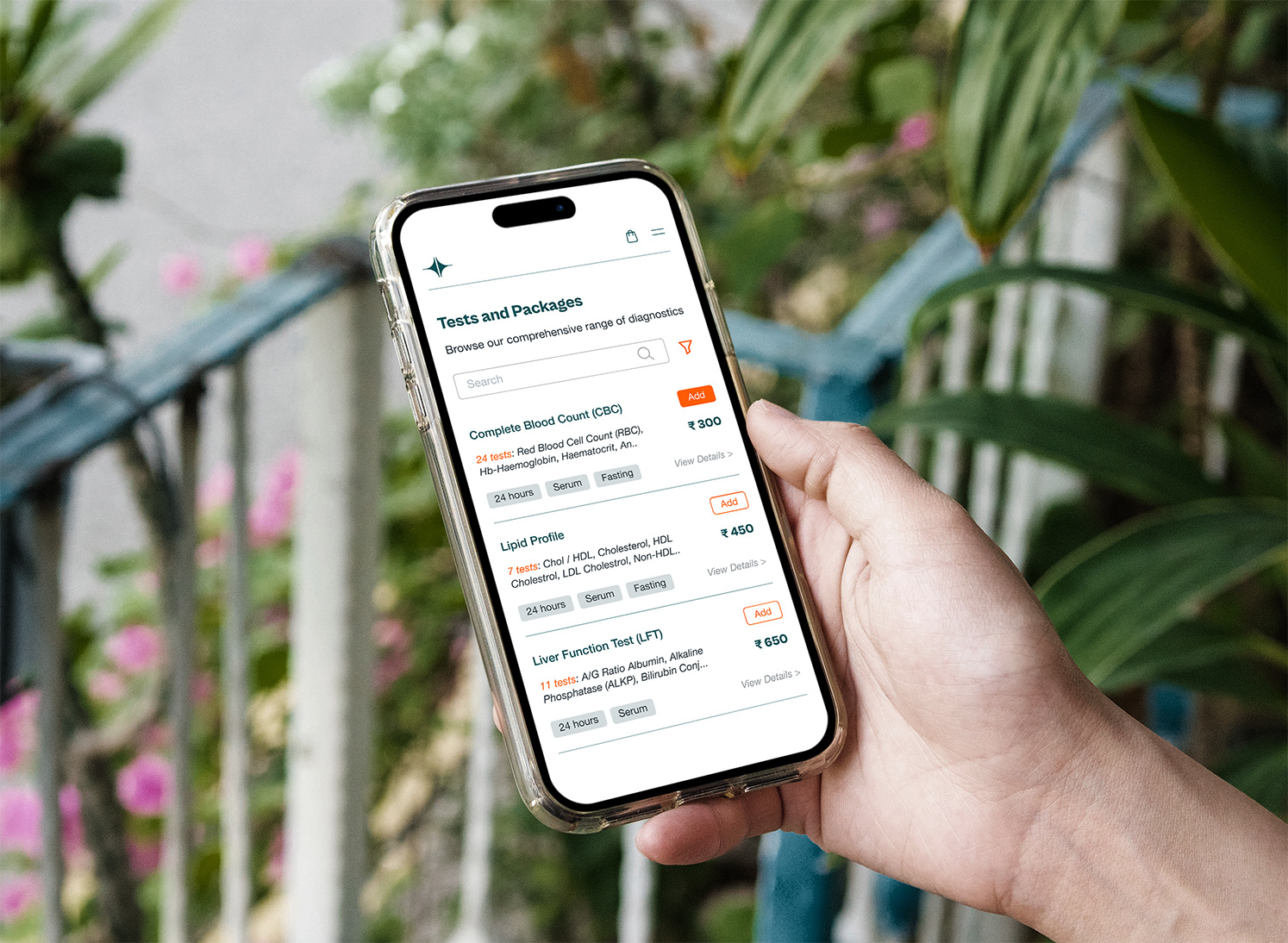
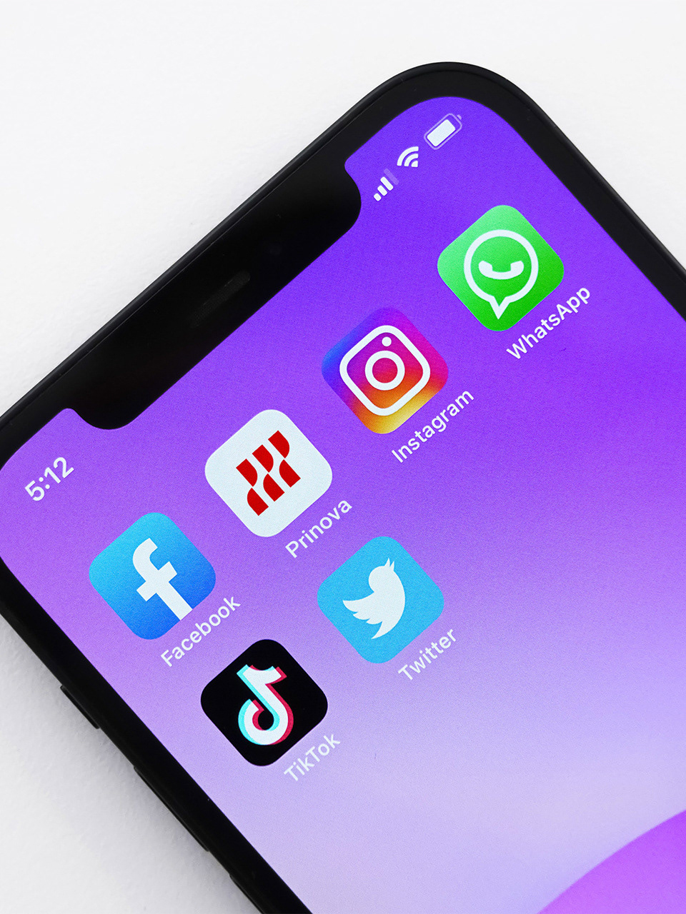
WIP for a website design where patients can book tests online
We had the pleasure of working with Suhas for our branding needs. He was empathetic, methodical, and brought a clarity that made the entire process feel effortless. We explored multiple options and variations, and he walked us through the thinking behind each one, recommending what best aligned with our expectations and values. The overall experience was exceptional, and we now have a modern, minimalist brand identity we’re excited to adopt. We look forward to working with him again.
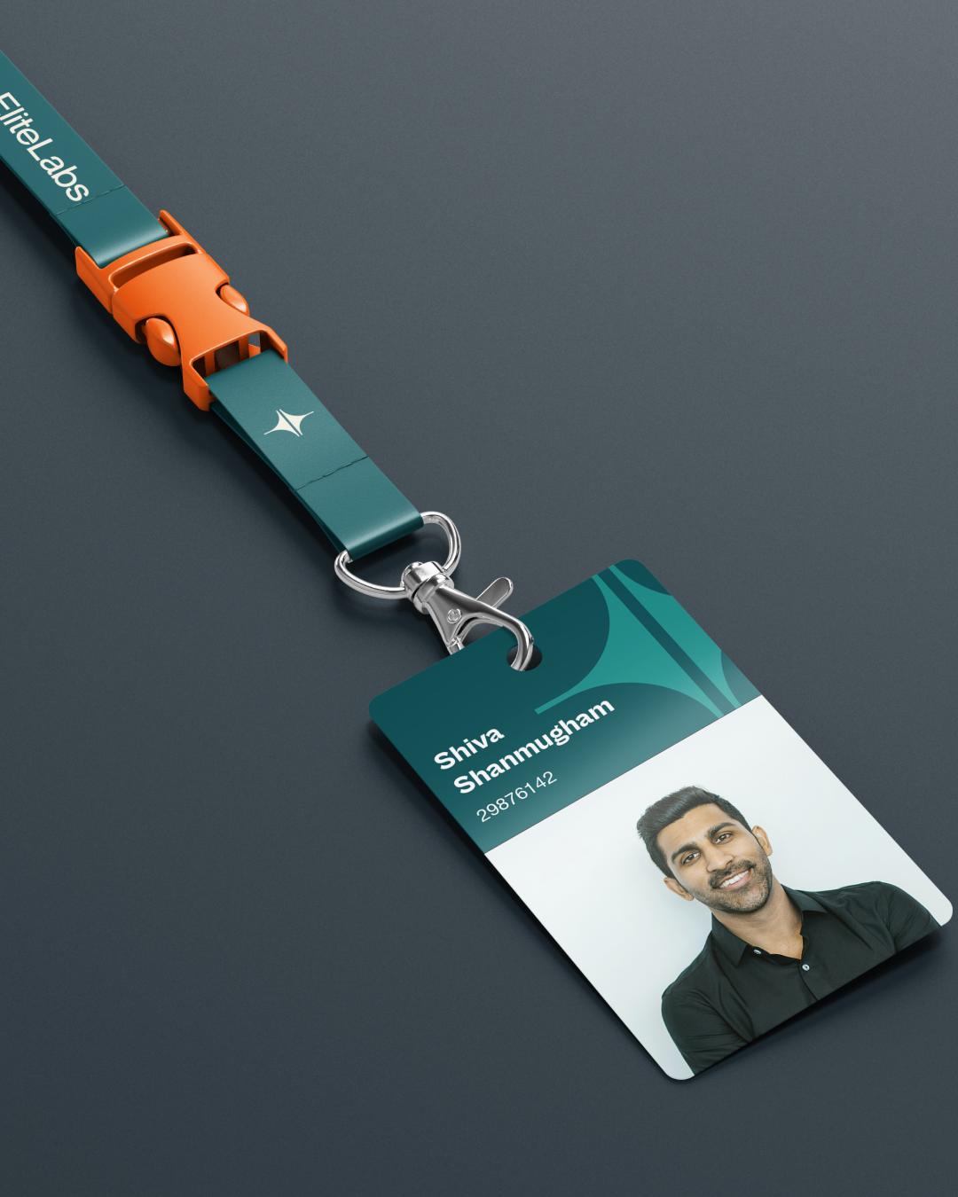
Shiva Shanmugham
The Challenge
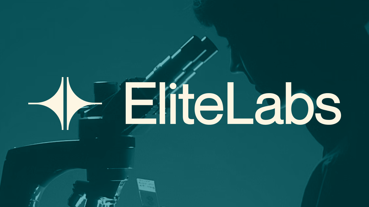
Most diagnostic brands feel cold, clinical, and transactional. Elite Labs wanted to change that — building a healthcare brand that felt modern, reliable, and genuinely empathetic. The goal was to make patients feel cared for, not processed.
The Approach
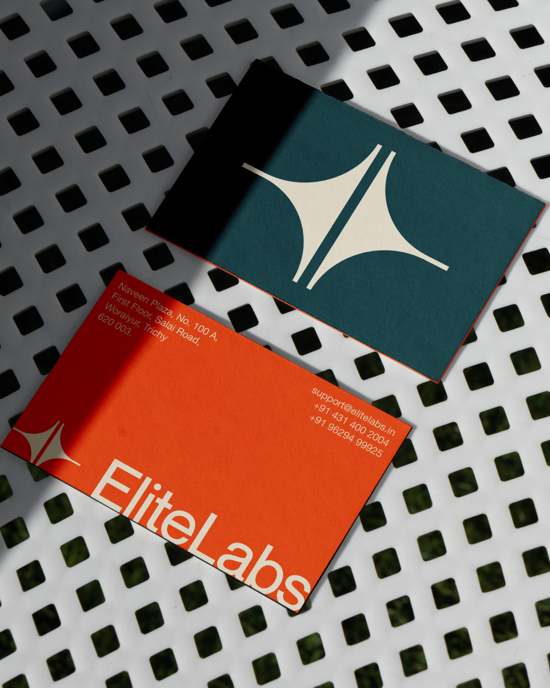
The identity was built around two core ideas: precision and connection. The logo symbol mirrors the form of a microscope — a nod to scientific accuracy — while also resembling a bridge, representing Elite Labs' mission to connect patients with accessible, quality healthcare.
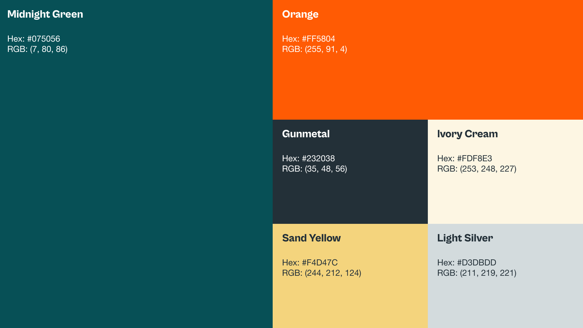
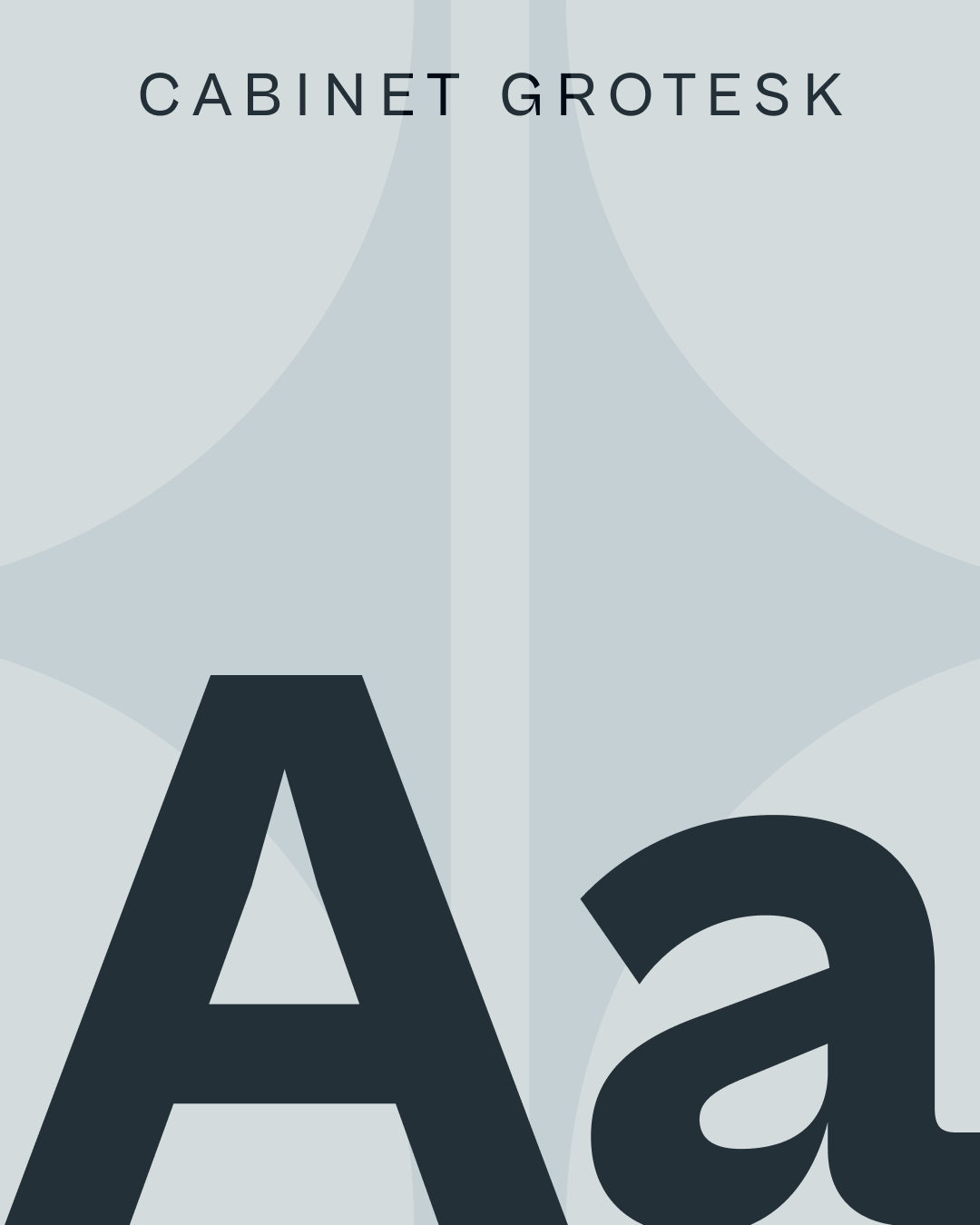
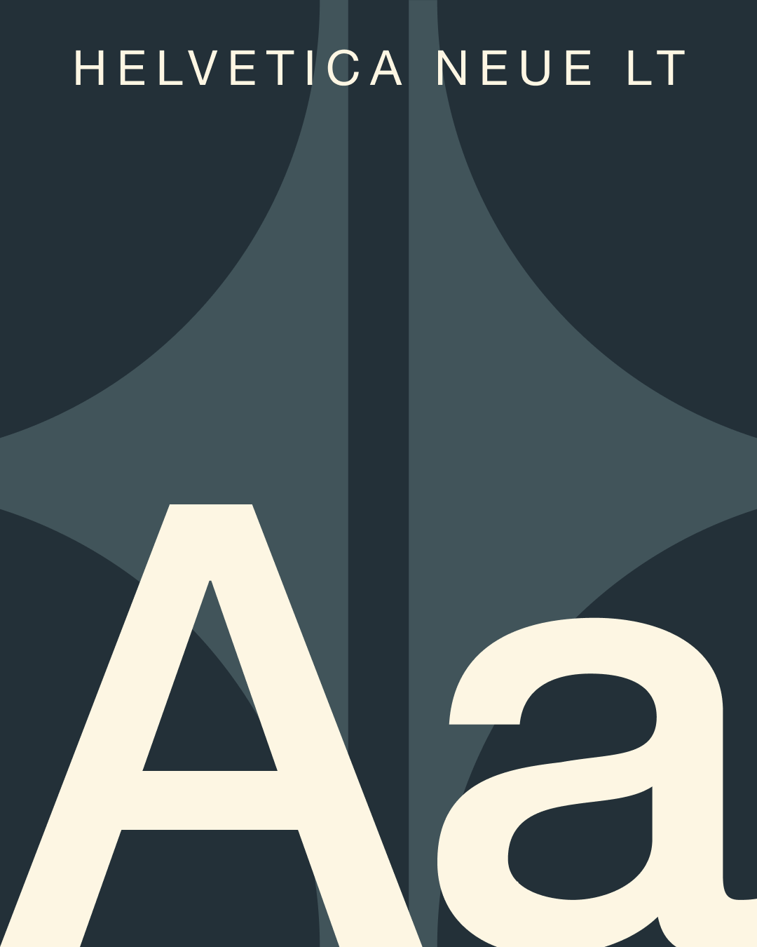
I developed the full identity system including the logo, colour palette, and design language, balancing minimal structure with soft tones to reflect both the human and technical sides of diagnostics. For social media, I designed a consistent, educational, and approachable content style built around health awareness, accuracy, and patient trust.
The Result
A calm yet confident brand identity that helped Elite Labs stand out as a modern, dependable healthcare brand. The client, Shiva Shanmugham, noted: "He was empathetic, methodical, and brought a clarity that made the entire process feel effortless. We now have a modern, minimalist brand identity we're excited to adopt."